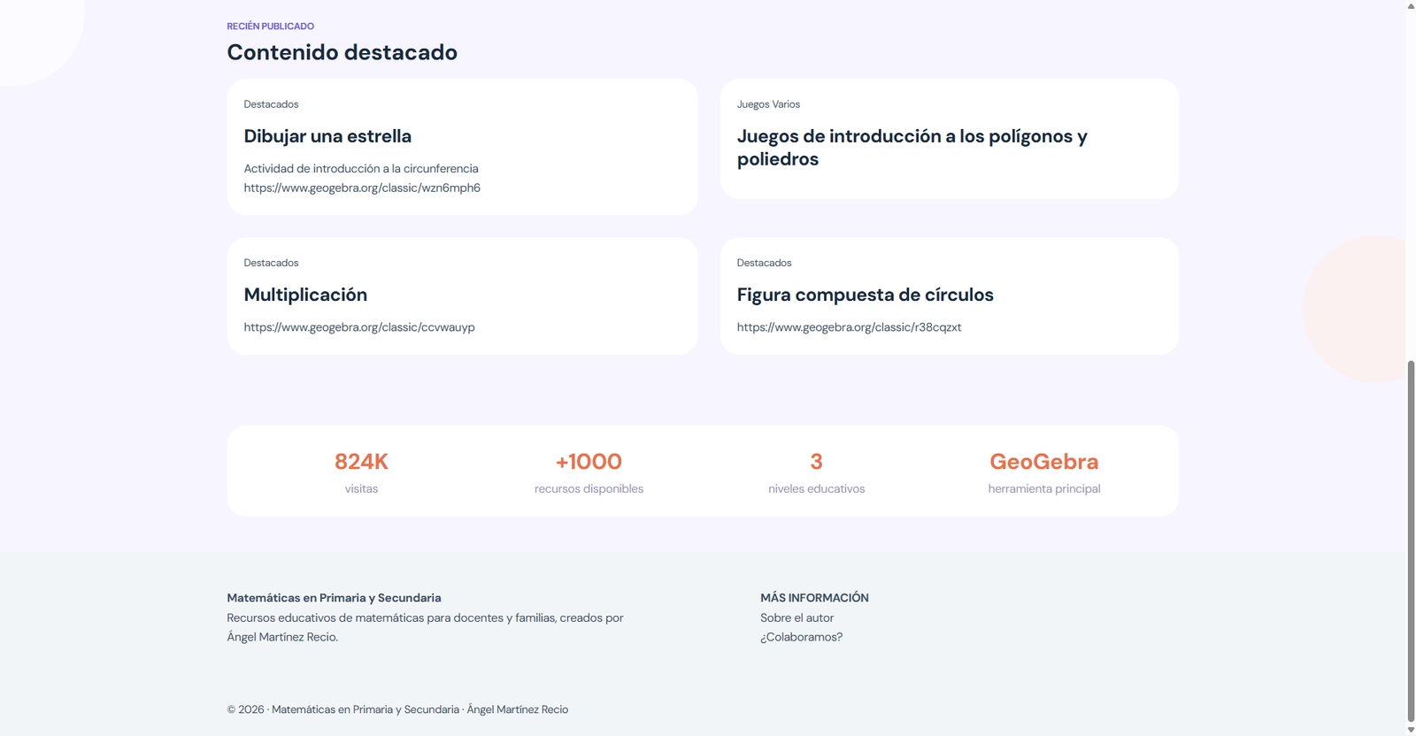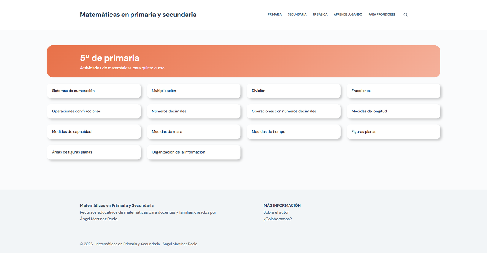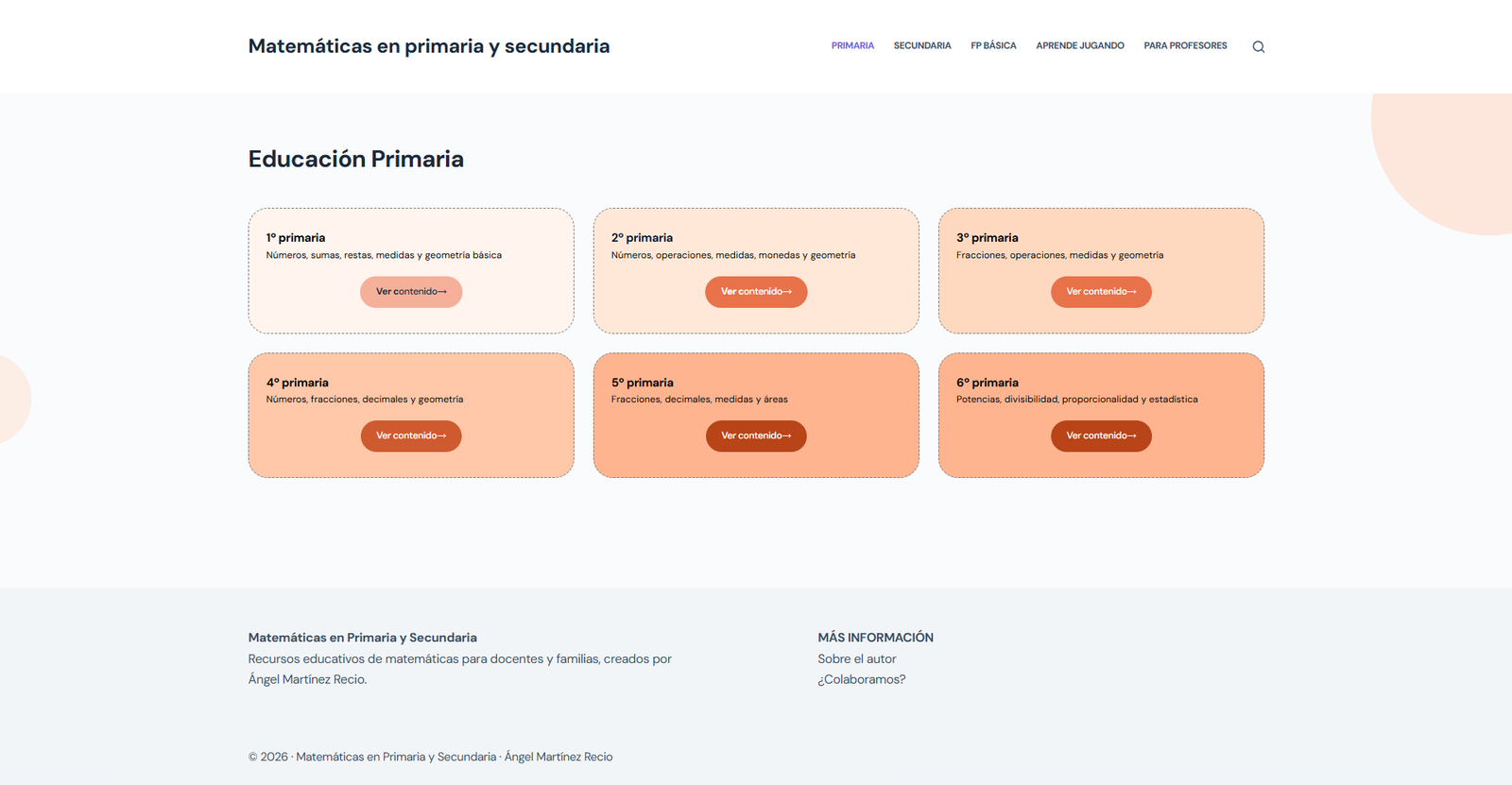
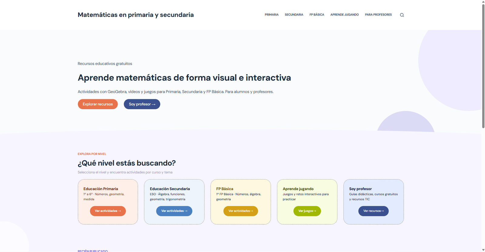
UX/UI redesign of an educational platform with 824,000+ visits. The homepage oriented no one; now every visitor finds their place in under 3 seconds.
The site has over 824,000 accumulated visits and 109 active subscribers, but the landing page displays a chronological blog feed without explaining what it is or who it is for. A new user bounces in less than 3 seconds because they cannot orient themselves. The menu has 10 items without hierarchy, mixing content for students with resources for teachers. The generic design hurts perceived credibility despite the high quality of the content.
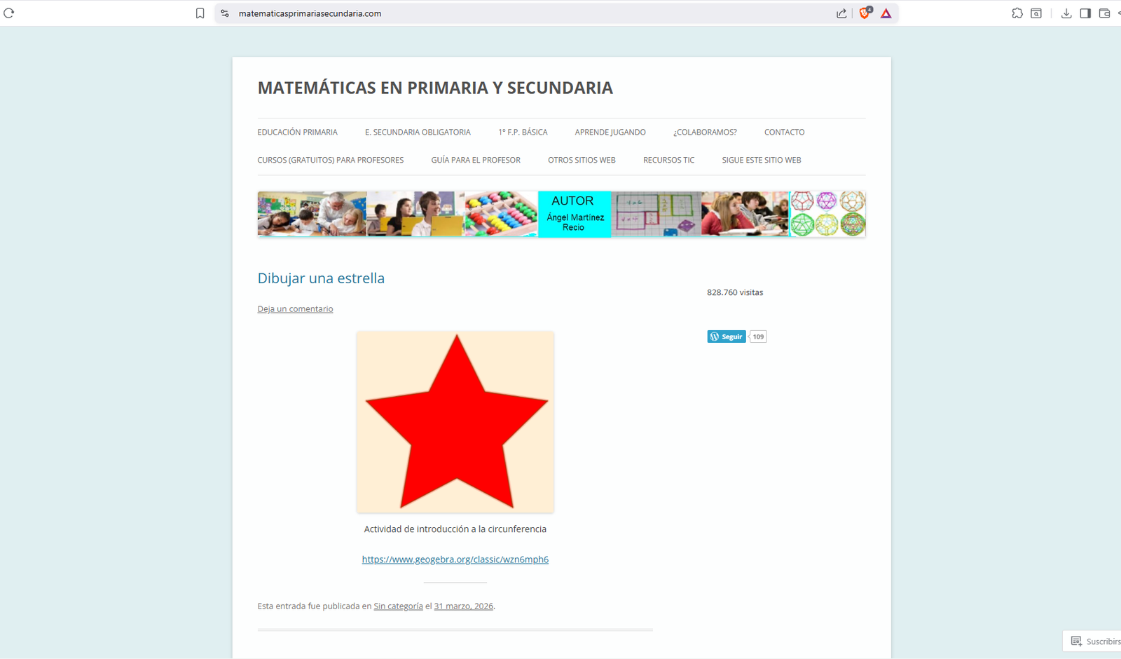
Audit based on Nielsen's 10 principles. Critical finding: absence of a user-oriented homepage — the landing page is a chronological feed, and visitors fail to understand the purpose in less than 3 seconds.
High-severity findings: a menu with 10 items without hierarchy and a generic design that misaligns content quality with visual perception. Medium severity: posts without metadata, scattered resources for teachers, and lack of mobile optimization.
Laura, teacher, 30–55 years old: seeks classroom-ready resources filtered by level and topic, but is unable to do so because teaching resources are scattered across the menu. Primary device: Desktop.
Miguel, student, 8–16 years old: wants to practice math independently but doesn't know where to start because the homepage doesn't guide him. Primary device: Mobile or tablet.
The analysis revealed that the main barrier to usage is structural: users cannot find
the content because the information architecture and navigation do not offer them a clear path.
The improvement proposal is structured around four axes:
1. Content Reorganization: restructuring content following the user's logic —grade → level
→ type— and creating profile-oriented landing pages ("Start Here" for students and teachers), so that any
visitor can orient themselves in less than three seconds from the landing page.
2. Visual Identity Modernization: updating the visual identity and reinforcing typographic
hierarchy to improve readability and reflect the actual quality of the content.
3. Interactive Exercises: incorporating interactive exercises and micro-rewards to increase
student motivation and time spent on site.
4. Filters & Search: implementing a filtering and search system that allows teachers to locate
specific resources efficiently.
Implementation priorities were ordered by impact and feasibility: information architecture and guide pages
→ filters and search → visual identity → interactivity and user testing.
The homepage is structured into 5 blocks in order of UX priority: hero with double CTA (student/teacher), educational level cards, featured content, credibility metrics, and footer with secondary elements.
The main constraint — not modifying the author's workflow — shaped the technical solution: the latest posts block updates automatically without manual intervention.
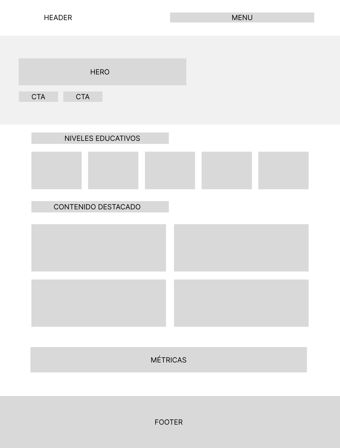
The palette responds to three fundamental principles of UX/UI applied to an educational context:
1. Progression by Age: Warmer, more energetic colors are assigned to younger levels
(Primary). As the educational level advances towards maturity (Secondary, Vocational), the colors become
cooler and calmer, conveying greater academic rigor.
2. WCAG AA Contrast: All background/text and background/button pairs meet a minimum
contrast ratio of 4.5:1 to ensure readability on any screen and lighting condition.
3. Coherent Visual Identity: Each section uses a different but harmonious color family.
Tones intensify progressively within each family to reflect progress and complexity.
Typography: DM Sans for the entire interface.
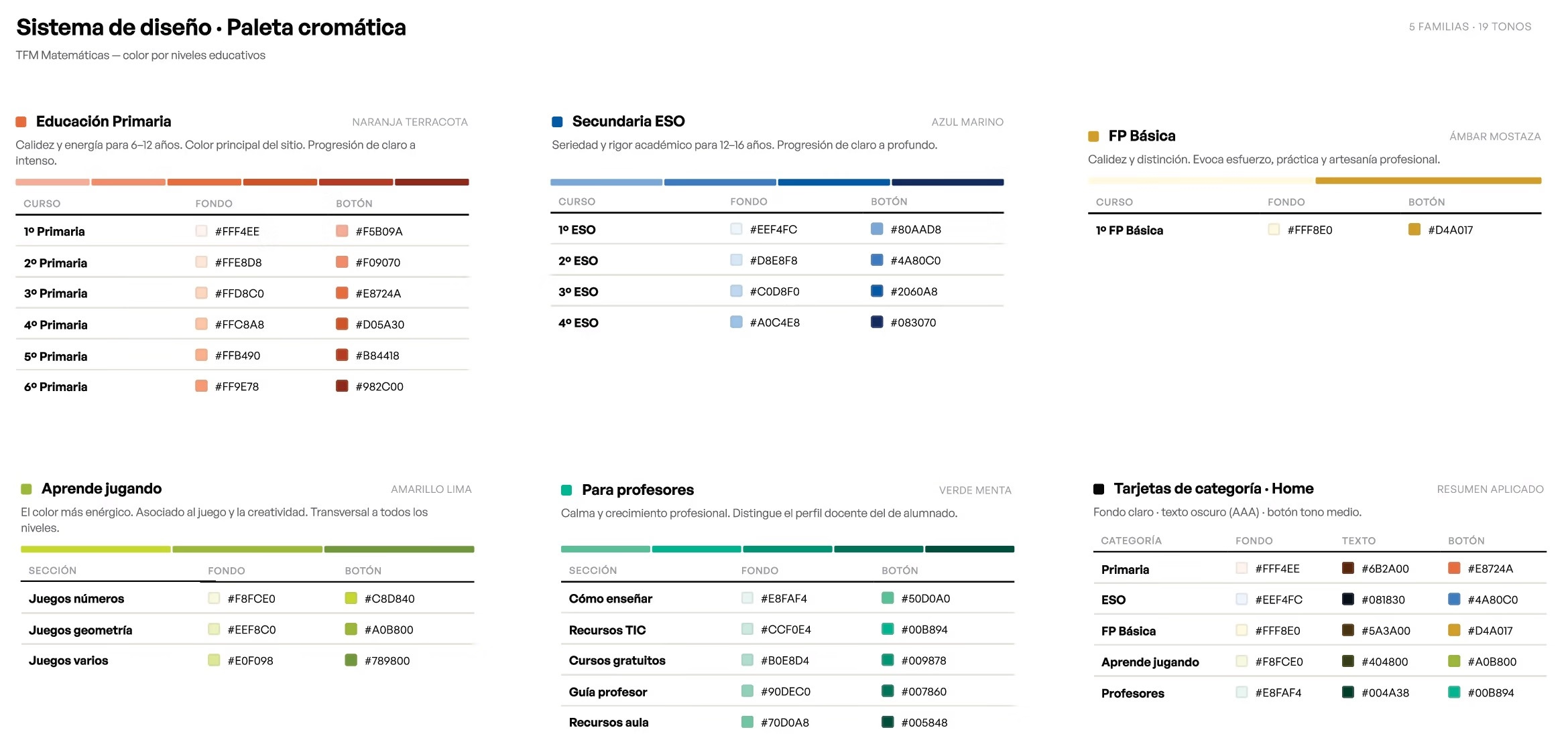
Covers the homepage on desktop (1440px) and mobile (390px), the Primary page in the new visual context, and the Teachers page as a new landing page grouping the Guide, Courses, and ICT Resources.
The implementation in WordPress Studio using the Kadence theme exclusively uses Gutenberg native blocks — without paid plugins or external dependencies. The palette and typography configuration is exported in JSON to replicate in production without redoing the work.
The new homepage guides the visitor in less than 3 seconds, the menu is reduced from 10 to 5 items, and the latest activities block updates automatically every time the author publishes a new post.