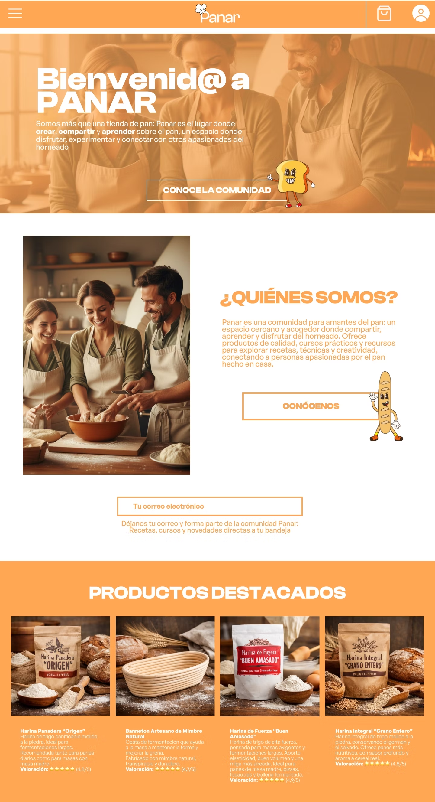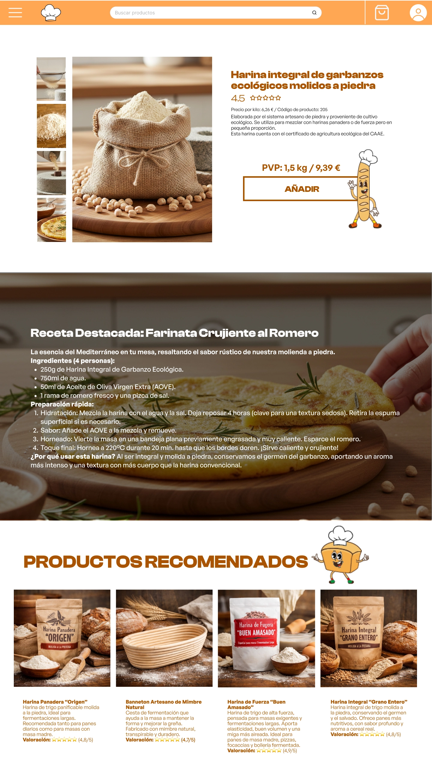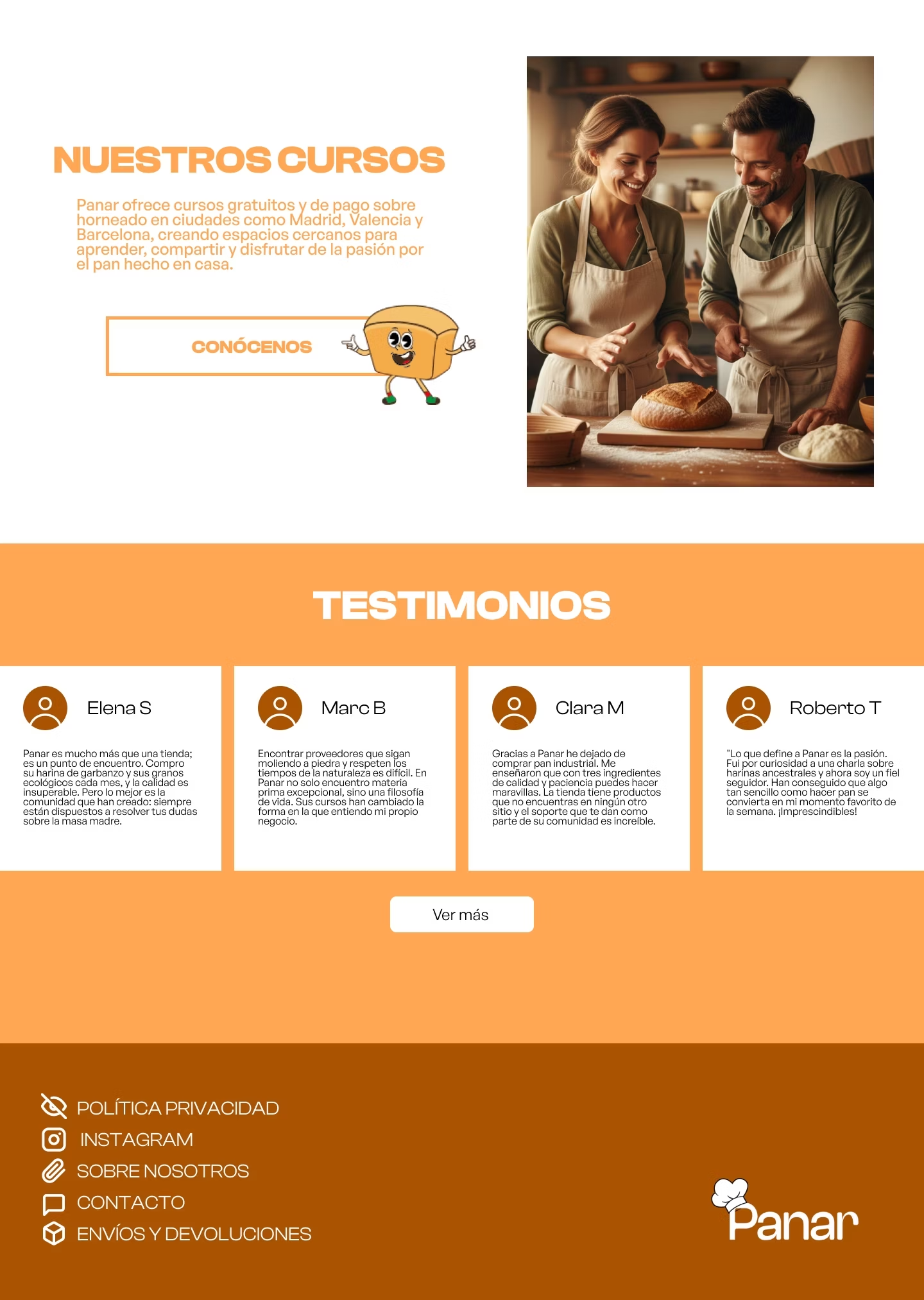
Web interface design for PANAR, a community for home-baking enthusiasts. A shop that's also a place to create, share and learn.
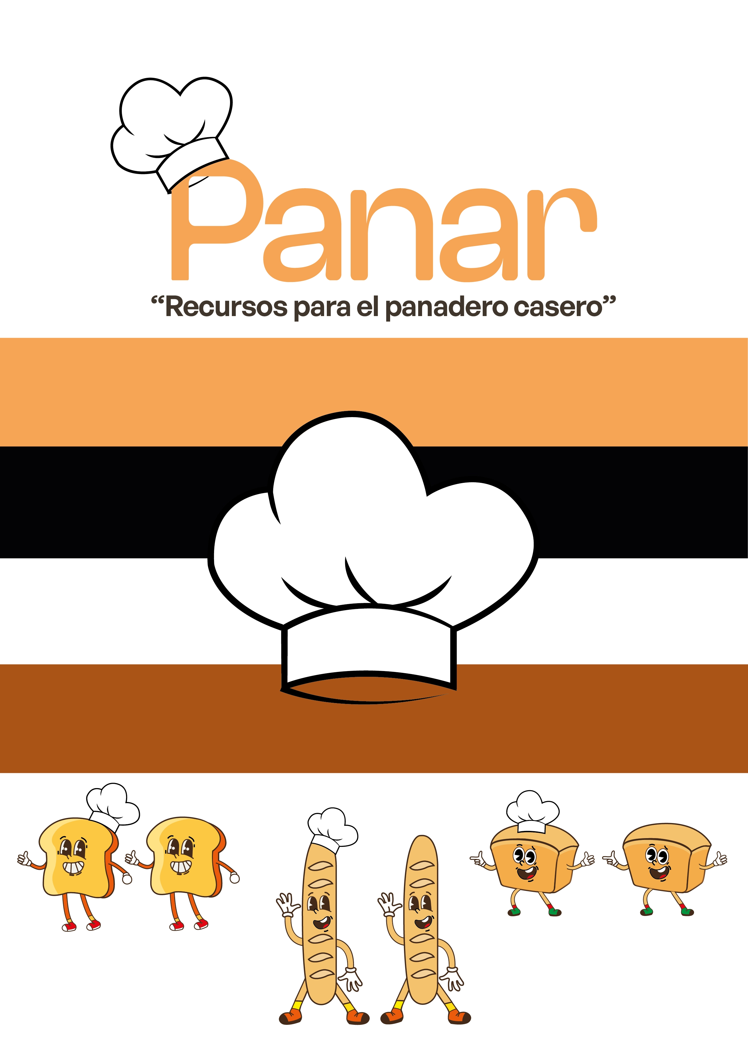
The challenge was to design an interface that communicated the community concept from the first scroll, allowed users to discover and purchase artisanal products intuitively, and reflected the visual identity already developed: warm tones, a friendly mascot, and modern typography.
Gastronomic community platforms and artisanal bakery shops were analyzed. Key finding: the most successful ones combine community building with rich product sheets —including reviews, detailed descriptions, and associated recipes— rather than separating the store and content into different sections.
Recurring error in references: prioritizing the product catalog over the value proposition, which turns the homepage into a simple listing of products without narrative or personality.
Marta, home baker, 28–45 years old: bakes at home regularly, looks for high-quality flours, and wants to connect with other enthusiasts. She values real reviews and recipes associated with the product. Primary device: Desktop.
Álex, new user, 25–40 years old: has seen the brand on social media and arrives out of curiosity. He doesn't know the project; he needs to understand what PANAR is before buying. The community aspect is what convinces him. Primary device: Mobile.
The analysis revealed that the biggest opportunity was to differentiate PANAR from a conventional
store from the very first scroll: the community concept had to be on the landing page, not buried
in an "about us" section.
The proposal was built around four pillars:
1. Community as protagonist: the homepage opens with a hero section explaining
what PANAR is —"more than a bread shop"— with a direct CTA to discover the community, before
displaying products.
2. Comprehensive product page: each product integrates customer reviews, technical
details, clear pricing, and a featured recipe, turning the purchase into a learning experience.
3. Credibility through reviews: a block of real reviews with ratings reinforces
trust without needing marketing copy.
4. Clean navigation: search, cart, and profile in the header; secondary info
(privacy policy, shipping, contact) grouped in the footer to keep the primary experience clean.
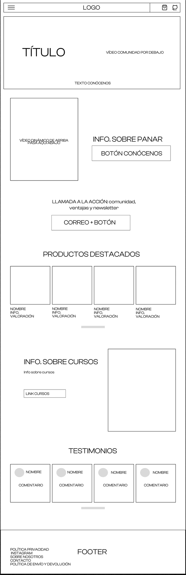
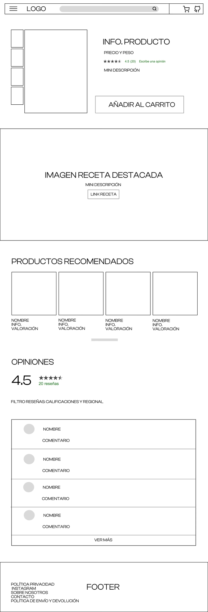
Two key pages were wireframed: the homepage and the product page. The homepage layout follows: hero with community value proposition → "About us" section → recommended products. The product page layout follows: image + price + rating → technical description → featured recipe → related products → customer reviews.
This sequence aligns with the logic of both personas: the new user needs to understand the context before buying; the returning user goes straight to the product and finds the validation they seek in the reviews.
PANAR's identity is based on three principles:
1. Chromatic warmth: a palette in orange and cream tones that evoke
freshly baked bread and connect emotionally with the product from the very first screen.
2. Mascot as a common thread: the baker mascot appears in the navigation,
product pages, and footer, bringing consistency and personality without cluttering the
interface.
3. Modern & legible typography: General Sans balances the artisanal character
of the logo with the clarity needed for reading technical product descriptions and
customer reviews.
The high-fidelity prototype covers the homepage on desktop (1440px) —featuring the community hero, the "About us" section, and a curated product selection— and the complete product page, with a featured recipe, customer reviews, and recommended items.